As PriceCharting has grown to cover trading cards, sports cards, and comics, in addition to video games, our user base has changed too. We made some small changes to the site to help users find the prices and data they are looking for.
Redesigned Menu
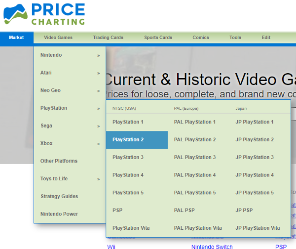
The menu has been updated to link to categories of collectibles. You can still get to specific video game consoles by hovering/clicking on the brand then choosing your console from the list.
Gamers can also click "video games" link and choose the exact console they want.
Other collectors can quickly find their collectible of choice now too.
Company Specific Pages for Video Games
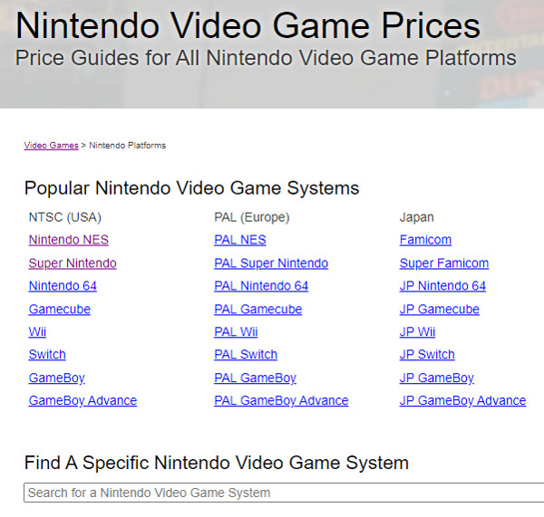
From the menu, users can select a company and find one page with all the platforms released by that company. Nintendo, Atari, Playstation, Xbox, etc.
That page lists all the consoles for every region so you can quickly find the platform your interested in.
Find Platform Page with Search
There is a new tool on the video game category page and the company specific pages too. You can start typing part of a console name and quickly be taken to that specific console page.
Type "3ds" and choose the one you want from the list. And you are taken directly to the Nintendo 3DS game list.
Filter Searches by Category
Searches can return results from multiple categories, but some users are only interested in a particular category. Search results are now easier to view and filter by category.
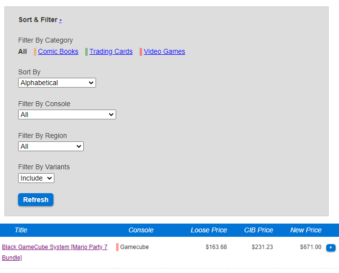
All results are color coded to make it easy to glance through results to find the category you are looking for. Games are red, trading cards are green, and comics are yellow.
The ability to filter results by category is always visible and just one-click away. "All" results is the default, but clicking on "Comics" or "Video Games" would filter the results to just that category.
This selection is persistant on your account/device. Filter by your favorite category once, and all future searches are filtered too. For example, if you only collect video games, filter results to "Video Games" once and all future results will show only video games unless you change it back.
Filter Searches by Other Metrics Too
You can still filter search results by console, region, and variant too. Just click the "Sort/Filter" header (or the little "+" symbol next to it) and you can choose other methods to sort and filter your results.
As always, please let us know what you think about these changes in the comments below. Thanks for using PriceCharting.


26 comments :
Awful. Trying to navigate between consoles is a complete mess now.
@anonymous - Thanks for the feedback. Can you elaborate on why it is a complete mess now? It should take one extra click compared to before. Click "video games" then click on the console you want.
I do want to know if I'm missing something and what your usage pattern is that was messed up. I always want to hear about that and take it into consideration.
The video games menu immediately closes for Chrome on Android when you tap it. The other menus stay open when tapped.
Playstation and Xbox links 404 from the main Video Games menu.
The search bar isn't as big as it was in the past. I think it might have changed before this latest deployment though. Chrome on Android.
I feel the same, its worse using the new menus. I mainly use the video game section, and hovering over the menu to get somewhere was the best way.
Example: When browsing for a certain system: Hover over "Nintendo" -> "Virtual boy" -> There!
Now with the new system: Hover over video games, press "Nintendo", Scroll down to "Browse Nintendo Video Game Systems", Find "Virtual Boy" in the list. Its not only one more click, its one more click, a scroll, and a search through a list since its just sorted alphabetically (PAL, JP, NTSC) in one big mess.
One idea would be to make the new menu a setting for those who have interest in more than only video games, and make the old menu (with headers like "nintendo", "sony", "sega") an option for those who use PC for mostly video games.
Another option would be that you added additional "hover menus" to the Video Games, when hovering over nintendo you get the old menu with PAL, NTSC, JP in those nice lists.
I hope my opinions & suggestions made sense ��
@anonysmous - Thanks for this feedback. I'm fixing the 404 errors now. That will be live soon. I'll work on a fix for the "automatically closes" when clicked on mobile problem. The search bar is slightly smaller now, but like you said that happened a little while ago.
@shawn - I like the idea for user's to pick a menu that they like the best and works for their purposes. Customization always pleases the most people. I'll look into that option and the multi hover option too.
I like how much the site has grown ever since I first found it back in summer 2020, and while the new menus are nice I preferred the old ones where we could hover over what we wanted. I don't know much about web design, but hopefully there's a way to work that into the new design; for instance, you hover over "Video Games" to summon that dropdown menu, and then hover over "Nintendo" to get another menu of their consoles. Just an idea for improvement in case it's possible.
Bring the sub-menu's back. Thats how 99% of people navigate here, and you're adding an extra click now that is unnecessary. It's a hassle to go into the console you want now. I know you're growing and adding more features and trying to grow the site, but bring this back or it will frustrate most of your day to day users. Thanks!
@GondoTheDragon and @Xenoshogun - Thanks for the feedbback. I appreciate it. I'll look into a way to allow console specific navigation with multiple hovers or something like that.
Before we implemented this we looked to see how popular the menus were. Roughly 8% of visits used the menu to navigate on the site. Most people use search instead.
That being said, I definitely want to find a solution that works well for the people who do use navigation (myself included).
I agree with the comments. Please bring the old menus back as an option in the settings at least. Also, I am sure the majority of the users here are still game collectors first and foremost even if they collect other things (like me with Yugi cards for example) so I think you should take that into consideration too. Thanks.
One idea I'd like to put out there is to separate the cards, comics, and video games into different "sites." You could personalize each one with different color palettes, but more importantly it would cut down on the clutter.
any chance of going back to how it was when the search bar was cleared each time you searched a game? makes it a lot slower to have to delete the last title you searched each time when you are looking for multiple games.
Thanks for the continued feedback. I appreciate it.
I'll be looking into ways to allow users to navigate directly to the console of their choice. Either with sub menus or settings that let users choose their default menu.
Regarding search behavior. Some users said they prefer keeping the original search term so they can refine it if needed. Other users like it cleared. Sounds like something we should change in settings so users can choose their preference depending on their preferred usage.
@everyone - The menu has been updated so you can select the console from the menu. Just hover over the brand and choose the specific console from the list. I've updated the image on this page to show it in action.
Thanks again for your feedback.
Many systems are misssing when you hover. Wiiu, DS, 3DS,etc
Better now. Thanks. At first it wasn't showing any sub-menus to access each system.
Though systems are still missing so that is still a problem.
@JJ Amazing job with the additional side-menus. Precisely how I imagined them. :D
As @FFTW said, some systems are missing.
Much worse since you've updated. Awful UI, I want to be able to search for every console, not just have to figure out how to search for other Nintendo Console pricing. You should change it back.
The reason I do not like this as much. If I am looking for the value of a game. example a specific mega man game. So I could type mega man into the search. There is no longer a way to filter it by console anymore. You have to scroll down the full list of all the different consoles to find the specific game value I am looking for, rather than the console I know it is on.
@FFTW and @antonuuu - I've added these missing platforms back into the menu too. The lists should be the same as before. Thanks for catching that omission.
@brownbomer and @anonymous - you can still filter search results by console just like before. You click the "Sort/Filter" header (or the little "+" symbol next to it) and the options to filter expands. This is the exact same behavior as before. Nothing has changed with those filter options being hidden at first and then available when clicked to expand. The category filter links are shown all the time now.
thanks I didnt notice the new location of sort option on the new layout.
Sub-menu's being back are great. Thank you for taking that into consideration. As a developer myself, I know it is hard to discern between what will help the majority and what are just great fairy ideas from random people. I like the rest of the changes, keep up the great work!
I'll drop my annual feedback for the lot value calculator. I wish the same collection indicator (and ability to add to collection) was there on the lot value calculator. I usually buy a lot and want to add the games I don't have to my collection. I do appreciate the work you put in and love the site!
@Shawn - Thanks for the request, glad you love the site. Unfortunately adding the collection button with color indicator is a fairly hard thing to accomplish on the lot calculator. It would be easy to add just the "+collection" part, but the color indicator to actually know if it is in your collection or not is harder. Sorry.
Post a Comment